Friday, June 11, 2010
Well, I did it!
Blogger rolled out some new templates and I was biting my nails trying to figure out if I should update. I've been wanting to do it for...oh...about three years now!
I received a lovely email from one of my blogging friends and she said, in a nutshell, UPDATE!! PLEASE!!!
So I did.
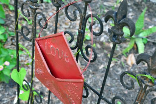
Send me some Love - tell me you like it - tell me you hate it if you do, of course. Goodness I'd hate to have something you didn't like to come visit.
I was able to enlarge the text. Oh, I'm so happy about that. I've been wanting it larger for quite some time, but only a little bit larger. I like this size.
I don't normally like light text on a dark background, but I think the sidebar colors aren't too dark. Let me know if you have trouble seeing the words and links.
I'm excited!
I've got a brand new place!!!
Welcome!!
Kristin


I LOVE IT!!!! Fantastic! So Goat like!
ReplyDeleteI love it. They told me that mine is not applicable!
ReplyDeleteI think it looks great, but I sure hope this doesn't mean I have to change mine. I HATE change - - - when I find something I like, I stick with it to the bitter end. I've had ENOUGH life changes in the past few weeks oh PLEASE don't make me do any more!!!!
ReplyDeleteHehehehehehehehehe
I'm not REALLY that stressed - - - just having a little fun with you about change.
JB - Thanks :)
ReplyDeleteJust Breathe - Not applicable...hmmm
Keetha - You have indeed had enough change this week to last quite awhile :) I'm not a huge fan of change either, that's why it's taken me many years to change a blog template that I really disliked! Can you believe I lived with it that long.
As Billy Joel would say --- "Don't go changing, to try and please me"
I love it too! Thank you so much for your sweet comments; it is people like you that inspire me to tell the sad story...I was born in Jacksonville..my parents have moved to Daytona Beach now; and when we drive down to see them we always stop in Jacksonville and check out the little house I lived in for my first 3 years..I only remember 1 thing from back then..getting bit all over by fire ants..ouch; could be why dirt and bugs freak me out so much!
ReplyDeleteworking my way down my reader i realized "YAY, i'm not that behind on kristin's blog! this change only occurred yesterday!"...even better i realized i can update mine, too...if i can ever find the time...yes, i like it!!!
ReplyDeleteLooks great, Kristin! Personally, I would consider moving your Etsy tab up to the top though. Your photos are so great, that it seems a shame to leave that at the bottom. Maybe the top would get more exposure.
ReplyDeleteJust something to think about.
Happy Saturday!
I like it! Gotta get use to everything being over on the left side, but it looks good!
ReplyDeleteLooks really good. I can't read the dark print on the dark background, but I've committed it all to memory by now, so no problem. LOL.
ReplyDeleteAnn in the UP
I like it and it appears I'm not too many days behind in noticing it....lm
ReplyDeleteI love it .. I was thinking about looking at the new templates too but I like my pink one too much still .. plus, since I'm not - and others aren't either - in my blog too often, it's not being overused. LOL. I do love your new format.
ReplyDeleteI like the change! I always want to change mine, too, but it is nerve-wracking to pick something just right. Nice look! :)
ReplyDeleteI love it. Looks great. I usually read in google and rarely come over, except to comment on one out of the series I am catching up on. But I can still appreciate a nice template. :) Hope you had a great weekend.
ReplyDelete